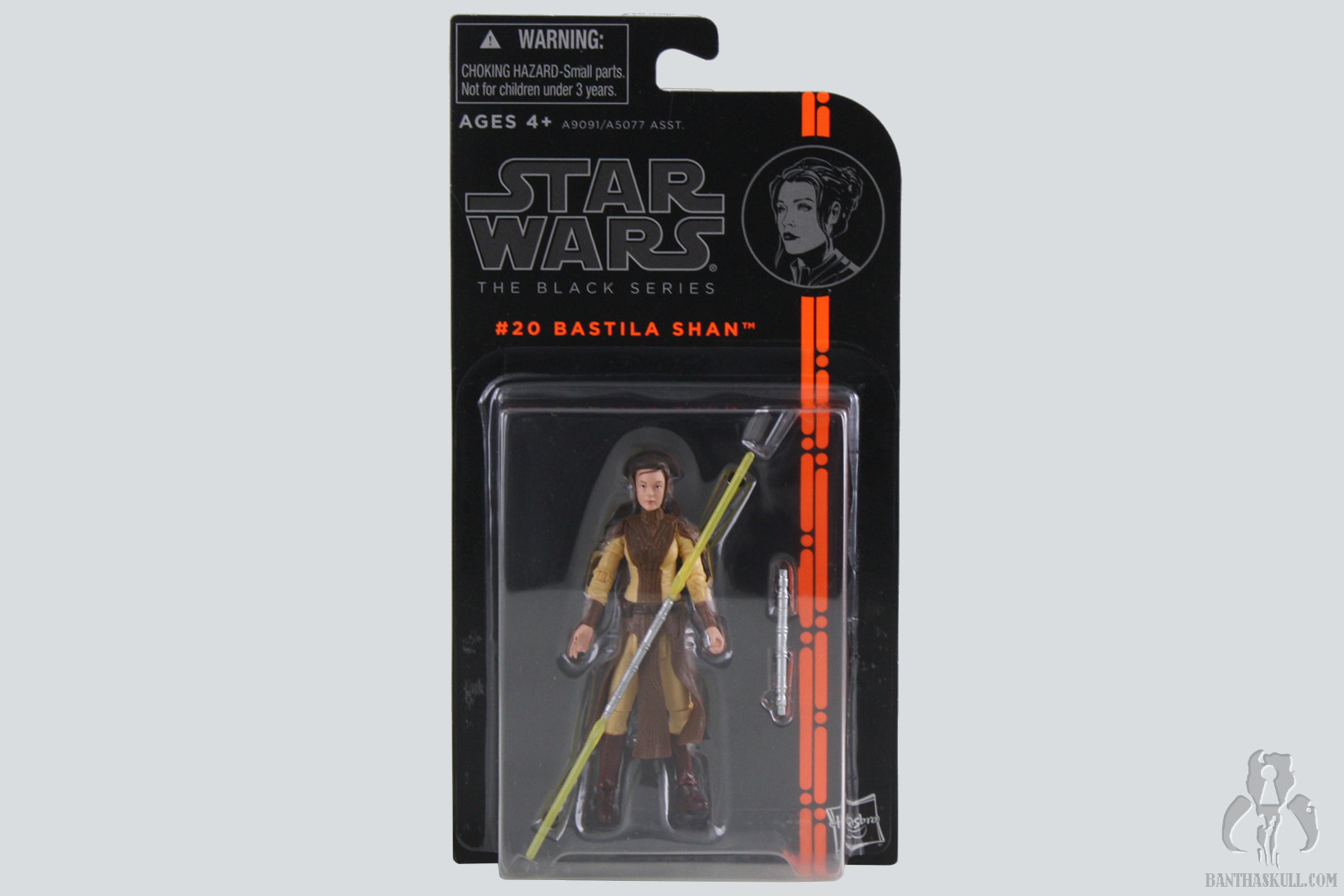
The Black Series

Bastila Shan


Editor’s Note: This review has been updated with a second look…
Original Review: Chris - 8/11/2014 08:00 AM
Bastila Shan is one of those Star Wars names that I’d never want to be the first one in the room to pronounce. Even though I played Knights of the Old Republic, from which the figure is sourced, in near marathon fashion sacrificing many hours of sleep, I don’t recall how the name is pronounced. I’m not sure if the “i” is a long i or a short i. My last days before the nursing home will probably be filled with a “ketchup / catsup” one man debate over the pronunciation. I don’t think I’d ever have the courage to attempt pronouncing Kitik Keed’kak in public.
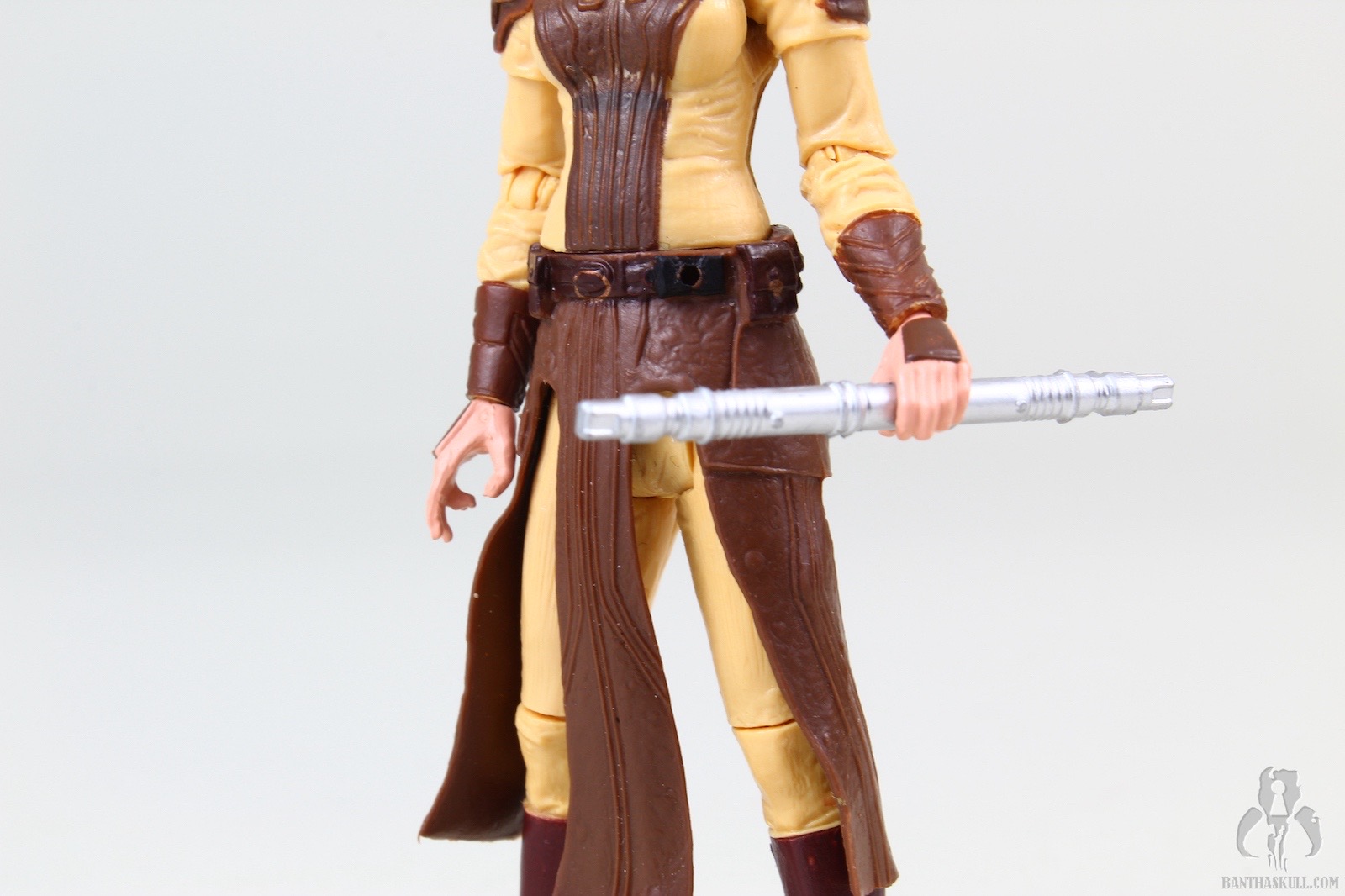
Because this figure is a re-release of the same figure from 2011 under the Vintage Collection banner, I thought an off-topic introductory paragraph would be tolerated. I hope you’re still here. I don’t believe I’m about to say this, but I like the Black Series offering better. A lot better. The Vintage Collection release was oddly broad faced with very wide set eyes. It made the figure vaguely reminiscent of Meathead from Meatballs II (crosses Meatballs II reference off bucket list). The Black Series offering looks much more natural to me. They eyes are presented at a more natural width and in a mild upset for the Black Series, they are actually painted accurately. Whether the face seems narrower because the sculpt is, in fact, smaller in dimension or because the lock of hair draping down the left side of the figures face is over painted, thus reducing the flesh toned area is a matter of debate. I honestly think it’s a combination of both. I consulted an independent third party who is legally entitled to half of everything I own, and she agrees. The lips on the figure are painted a little inaccurately and are slightly too narrow. This gives the figure a pursed lips expression, but it’s not overly distracting. Given the recent sloppiness of Black Series paint applications, the preferable appearance of my sample’s head sculpt is partly luck in all likelihood. In the unlikeliest event that you get to choose between multiple samples at retail, you might want to give careful inspection.
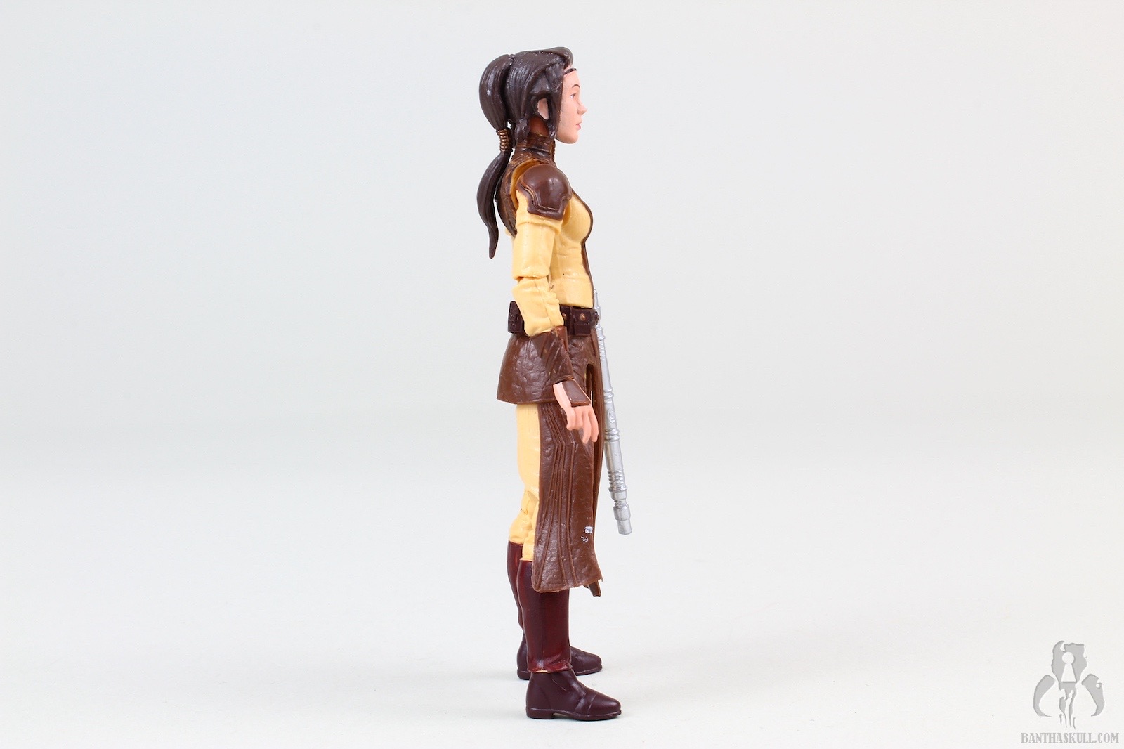
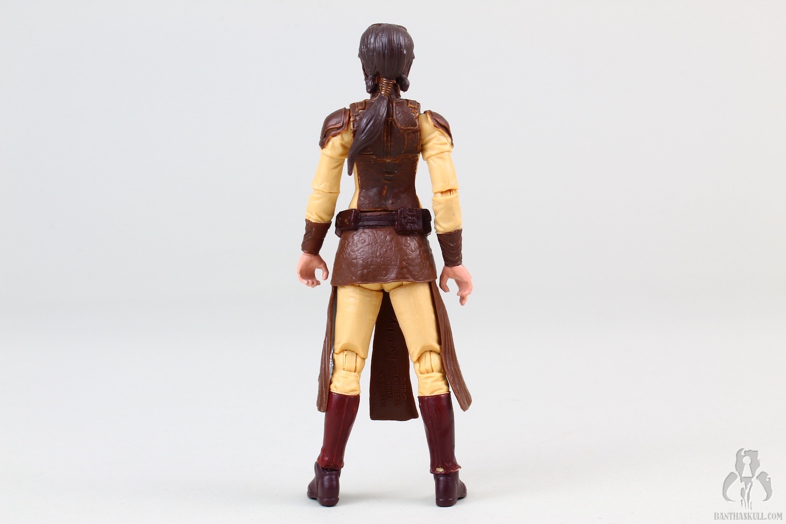
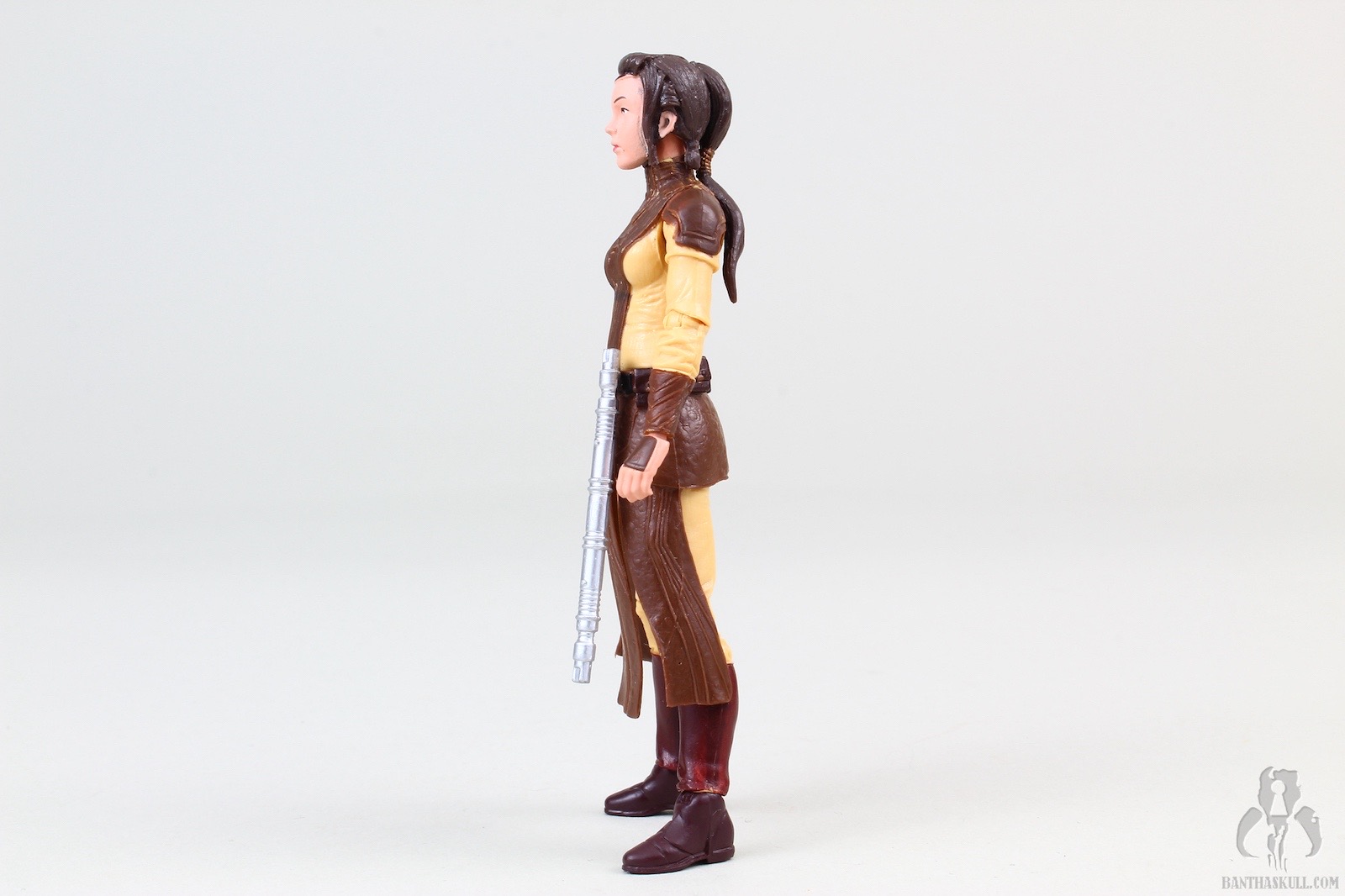
The other noticeable difference between the 2011 and 2014 releases is that the brown elements on the costume are painted with a much lighter shade of brown. I personally prefer the lower contrast this offers against the yellow of the costume. The lighter shade could be the result of a much thinner coat of paint being used. That lighter coat allows some of the underlying yellow to show through at the higher points of the sculpt. The end result is very much a “Star Warsy” used universe appearance. I’m not going to give Hasbro credit for this because I don’t think it was a conscious design choice. I think it’s a happy accident resulting from the recent cost cutting measures, but it works for me. The rest of the figure is what one should expect for “state of the art” for a 2011 sculpt. It would greatly benefit from ball jointed hips, but that type of articulation wasn’t an entitlement in 2011 the way we feel it is today with Jedi figures. Absent of the premium point of articulation, the figure can still strike a satisfactory amount of dueling poses. I am pleasantly surprised with the end result of what I feel is a 9 out of 10 figure.
Updated Review: Bret - 11/14/2018 07:05 AM
Bastila Shan is essentially a repack of the TVC69 figure we reviewed several months ago. That figure was apparently impossible to find, if you ask people who remember such things. One common complaint about the figure at the time was that the face was weirdly painted, with the eyes far apart. Bastila Shan was intended to be an attractive woman, and the Hasbro version was anything but. The figure’s scarcity caused prices to skyrocket on the secondary market. I believe that some samples even reached billion dollar asking prices. So it was seemingly a home run for Hasbro to re-release the figure. Hasbro definitely improved the appearance of the face. While FACE! Technology did not exist at the time, apparently Hasbro hired Peter Griffin to help, due to his success as Uma Thurman’s eye wrangler on the set of Pulp Fiction. The result is somewhat better due to the improved eye placement, although the paint applications overall are a bit weak. The color of the outfit has changed slightly, as you can see in the comparison photos.
This figure was available at a time when I was only barely clinging to collecting. The Black Series, besides being horrendous in general, happen to be available at a time in my life when I was pre-occupied with other things, and didn’t have the time to devote to keeping track of the latest collectibles. During that time, Chris was basically running the site by himself. My connection to collecting was just to go through the motions to ensure that I could maintain some semblance of my “completism.” As such, I would usually text Chris and ask him if I needed to buy a figure, which was my shorthand for “Do I need this figure to complete my collection because it is either new or new-enough-to-make-me-mad (thanks, Adam Pawlus), or can I safely pass on it?” If I recall correctly, and I always never do, Chris told me I had to have it because the face was so much better than TVC that it was worth getting. So I did. It was in the package until maybe about 2 years ago, when I was reorganizing my collection. I promptly threw the figure in a bin, never really comparing the two faces. Now that I just photographed both together for the first time, it is very clear to me that Chris was absolutely somewhat barely correct by certain standards. I would probably classify this figure as a straight repack. I don’t know if the paint differences were truly intentional in an effort to upgrade the figure, or they’re just a matter of manufacturing differences with the figures being releases several years apart. I’m sure Chris is glad he told me to buy it, because it got him out of having to photograph and review this figure.
By the way, Chris did not tell me to by #09 Biker Scout, which is why we temporarily skipped over it. I could kill that guy. That figure is different from the previous release on which it is based due to some parts of the ammo belt being white instead of black. Joke’s on him, because now he has to review it! HAHAHAHAHA!
Anyway, if you didn’t get this figure in TVC, Hasbro offered a second opportunity. It’s a very nice figure, from either TVC or TBS. My only gripe is the lack of ball jointed hips, which should be standard for Jedi today, but understandably were not so standard at the time. Bastila doesn’t need an upgrade, but the hips, wrists, and waist joints could be improved, and an all new face/head should be implemented. Chris rated this figure a 9, which made sense at the time. Since we shifted our standards a bit, I will lower this to a still excellent 8, which is the same we gave the TVC figure. It’s arguable that this figure has better paint applications than the earlier release, but not enough to give it a whole point upgrade. 8/10 it is.
Verdict: No Action
Since this figure was already re-released, there’s no need for any action on Hasbro’s part. Ebay prices for the TBS version are low to moderate, while “the same” figure in TVC packaging goes for 2-3 times the price. Some carded TVC collector who missed out might enjoy a repack to save on the ebay expense, but I don’t think it would be a good idea for the line. Perhaps a KOTOR multi-pack might be cool as some kind of limited exclusive. If Hasbro really wanted to revisit this figure (and they shouldn’t) they should make an all-new sculpt with better articulation and FACE! technology.
Verdict Guide:
Re-sculpt = The figure is not definitive, and a new version should be developed.
Re-issue = This version is definitive (or close enough), and shows sufficient secondary market demand to warrant a straight repack.
No Action = This release does not require new attention.